
自定义首页
概述
主题提供了十分灵活的方式来自定义首页。你可以根据你的需求来定制你的首页。
主题通过 frontmatter 来定义你的首页。在 sourceDir 的 README.md 文件中,编写 frontmatter。
---
home: true
config:
  - type: custom
---
主题 遵循 流式布局的方式来渲染首页,将 首页 在 垂直方向上划分为一个个独立的区域,每个区域应用不同的组件。
通过 config 属性,以 数组 的形式,可以定义多个区域。通过 type 字段,可以定义该区域的类型。 主题内置了 banner, hero,text-image,image-text,features,profile,custom 等不同的类型, 你可以随意组合使用它们,组装成你的自定义首页。 如果它们均不满足你的需求,你也可以 编写自定义组件,来自定义你的首页。
配置
home
- 类型:
boolean
声明该页面是否为首页
config
- 类型:
PlumeHomeConfig[] - 默认值:
[]
根据数组的顺序定义页面的区域内容。
interface PlumeHomeConfigBase {
  /**
   * 该区域的类型,根据类型应用不同的组件
   */
  type: 'banner' | 'hero' | 'text-image' | 'image-text' | 'features' | 'profile' | 'custom' | string
  /**
   * 该区域是否占满全屏
   */
  full?: boolean
  /**
   * 该区域的背景图片
   * 你可以定义在 浅色/暗色 模式下的背景图片
   */
  backgroundImage?: string | { light: string, dark: string }
  /**
   * 该区域的背景 定位方式
   */
  backgroundAttachment?: 'fixed' | 'local'
}
区域类型
banner
- 类型:
PlumeThemeHomeBanner
大屏 banner, 适用于放置在 首页的 首位。
interface PlumeThemeHomeBanner extends PlumeHomeConfigBase {
type: 'banner'
/**
* 背景大图
*/
banner?: string
/**
* 取值范围: 0 - 1。配置首页 banner 大图的遮罩蒙版不透明度。
* 支持配置 浅色/深色 模式下 的不同值。当值为 0 时,不显示遮罩蒙版。
* 这在首页首屏大图比较亮时,可以适当使图片看起来暗一些。
*/
bannerMask?: number | { light?: number, dark?: number }
hero?: {
name: string
tagline?: string
text?: string
actions?: {
theme?: 'brand' | 'alt'
text: string
link?: string
}
}
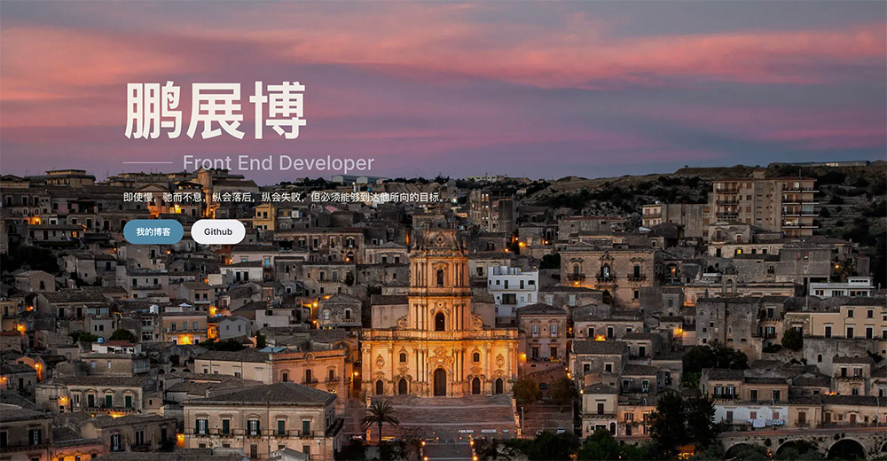
}示例:
---
home: true
config:
  -
    type: banner
    banner: https://api.pengzhanbo.cn/wallpaper/bing
    bannerMask:
      light: 0.1
      dark: 0.3
    hero:
      name: 鹏展博
      tagline: Front End Developer
      text: 即使慢,驰而不息,纵会落后,纵会失败,但必须能够到达他所向的目标。
      actions:
        -
          text: 我的博客
          link: /blog/
          theme: brand
        -
          text: Github
          link: https://github.com/pengzhanbo
          theme: alt
---
效果:
hero
- 类型:
PlumeThemeHomeHero
适用于 文档 类型站点,放置于 首位。
interface PlumeThemeHomeHero extends PlumeHomeConfigBase {
  type: 'hero'
  hero: {
    name: string
    tagline?: string
    text?: string
    actions?: {
      theme?: 'brand' | 'alt' | 'sponsor'
      text: string
      link?: string
      icon?: string // 文本左侧图标
      suffixIcon?: string // 文本右侧图标
      target?: '_blank' | '_self' | string
      rel?: string
    }
  }
  /**
   * 主题内置的背景效果,如果为非预设背景效果,则可以传入背景图片链接地址
   */
  effect?: 'tint-plate' | 'prism' | 'pixel-blast' | 'hyper-speed' | 'liquid-ether'
    | 'dot-grid' | 'iridescence' | 'orb' | 'beams' | 'lightning' | string
  /**
   * 背景效果配置项,根据 `effect` 值不同,配置项不同
   */
  effectConfig?: any
  /**
   * 如果是非预设背景,可以设置背景图片的滤镜效果
   */
  filter?: string
}主题还支持自定义 name, tagline, text 的颜色。
通过 CSS Vars 进行配置。
/* 默认设置,可以在 `index.css` 中覆盖 */
:root {
  /* home hero name 背景色,通过背景色裁剪的方式定义文本颜色,
   因此,可以设置渐变背景的方式使文本更具表现力 */
  --vp-bg-home-hero-name: linear-gradient(315deg, var(--vp-c-purple-1) 15%, var(--vp-c-brand-2) 65%, var(--vp-c-brand-2) 100%);
  --vp-c-home-hero-tagline: var(--vp-c-text-2);
  --vp-c-home-hero-text: var(--vp-c-text-3);
}
doc-hero
- 类型:
PlumeThemeHomeDocHero
适用于 文档 类型站点,放置于 首位。
interface PlumeThemeHomeDocHero {
type: 'doc-hero'
hero: {
name: string
tagline?: string
text?: string
image?: string
| { src: string, alt?: string }
| { dark: string, light: string, alt?: string }
actions?: {
theme?: 'brand' | 'alt' | 'sponsor'
text: string
link?: string
icon?: string // 文本左侧图标
suffixIcon?: string // 文本右侧图标
target?: '_blank' | '_self' | string
rel?: string
}
}
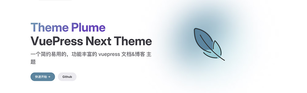
}示例:
---
home: true
config:
  -
    type: doc-hero
    hero:
      name: Theme Plume
      text: VuePress Next Theme
      tagline: 一个简约易用的,功能丰富的 vuepress 文档&博客 主题
      image: /plume.png
      actions:
        -
          theme: brand
          text: 快速开始 →
          link: /guide/intro/
        -
          theme: alt
          text: Github
          link: https://github.com/pengzhanbo/vuepress-theme-plume
---
效果:
主题还支持自定义 name, tagline, text 的颜色,以及 image 的背景色。
通过 CSS Vars 进行配置。
/* 默认设置,可以在 `index.css` 中覆盖 */
:root {
  --vp-home-hero-name-color: transparent;
  --vp-home-hero-name-background: linear-gradient(120deg, var(--vp-c-purple-1) 30%, var(--vp-c-brand-2));
  --vp-home-hero-tagline: var(--vp-c-text-2);
  --vp-home-hero-text: var(--vp-c-text-1);
  --vp-home-hero-image-background-image: linear-gradient(-45deg, var(--vp-c-brand-soft) 50%, var(--vp-c-brand-2) 50%);
  --vp-home-hero-image-filter: blur(44px);
}
features
- 类型:
PlumeThemeHomeFeatures
适用于展示 特性、功能、等。
interface PlumeThemeHomeFeatures extends PlumeHomeConfigBase {
type: 'features'
title?: string
description?: string
features: PlumeThemeHomeFeature[]
}
interface PlumeThemeHomeFeature {
/**
* 图标,也支持传入 iconify 图标名
*/
icon?: FeatureIcon
title: string
details?: string
link?: string
linkText?: string
rel?: string
target?: string
}
type FeatureIcon = string | {
src: string
alt?: string
width?: string
height?: string
wrap?: boolean
} | {
light: string
dark: string
alt?: string
width?: string
height?: string
wrap?: boolean
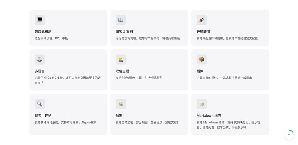
}示例:
---
home: true
config:
-
type: features
features:
-
title: 响应式布局
icon: 💻
details: 适配移动设备,PC,平板
-
title: 博客 & 文档
icon: 📖
details: 无论是想写博客,或想写产品文档,或者两者兼顾
-
title: 开箱即用
icon: 🚀
details: 支持零配置即可使用,也支持丰富的自定义配置
-
title: 多语言
icon: ⚖
details: 内置了 中文/英文支持,还可以自定义添加更多的语言支持
-
title: 双色主题
icon: 👨💻
details: 支持 浅色/深色 主题,包括代码高亮
-
title: 插件
icon: 📦
details: 内置丰富的插件,一站式解决网站一般需求
-
title: 搜索、评论
icon: 🔍
details: 支持多种评论系统,支持本地搜索、Algolia搜索
-
title: 加密
icon: 🔒
details: 支持全站加密、部分加密(加密目录、加密文章)
-
title: Markdown 增强
icon: 📝
details: 支持 Markdown 语法,支持 代码块分组、提示容器、任务列表、数学公式、代码演示等
---效果:
text-image | image-text
- 类型:
PlumeThemeHomeTextImage
左右布局的 文本 和 图片。
interface PlumeThemeHomeTextImage extends PlumeHomeConfigBase {
type: 'text-image' | 'image-text'
image: PlumeThemeImage
width?: number | string
title?: string
description?: string
list: (string | { title?: string, description?: string })[]
}
type PlumeThemeImage
= | string
| { src: string, alt?: string }
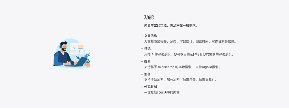
| { dark: string, light: string, alt?: string }示例:
---
home: true
config:
-
type: image-text
title: 功能
description: 内置丰富的功能,满足网站一般需求。
image: /images/plume-1.svg
list:
-
title: 文章信息
description: 为文章添加标签、分类、字数统计、阅读时间、写作日期等信息。
-
title: 评论
description: 支持 4 种评论系统,你可以自由选择符合你的需求的评论系统。
-
title: 搜索
description: 支持基于 minisearch 的本地搜索, 支持Algolia搜索。
-
title: 加密
description: 支持全站加密、部分加密(加密目录、加密文章)。
-
title: 代码复制
description: 一键复制代码块中的内容
-
type: text-image
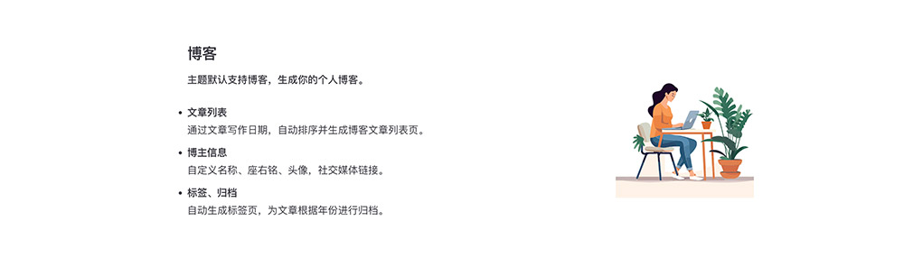
title: 博客
description: 主题默认支持博客,生成你的个人博客。
image: /images/plume-2.svg
list:
-
title: 文章列表
description: 通过文章写作日期,自动排序并生成博客文章列表页。
-
title: 博主信息
description: 自定义名称、座右铭、头像,社交媒体链接。
-
title: 标签、归档
description: 自动生成标签页,为文章根据年份进行归档。
---效果:
posts
将 post 集合文章列表页 作为一个单独区域,插入到 首页中。
interface PlumeThemeHomePosts extends PlumeHomeConfigBase {
  type: 'posts'
  collection?: string
}
当存在多个 post 集合时,默认读取第一个集合的文章列表页。 还可以通过 collection 配置项来指定读取哪个集合的文章列表页。
collection 的值应该与 集合的 dir 值相同。
示例:
---
home: true
config:
  -
    type: posts
    collection: blog
---
profile
- 类型:
PlumeThemeHomeProfile
展示个人信息。
interface PlumeThemeHomeProfile extends PlumeHomeConfigBase {
  type: 'profile'
  name?: string
  description?: string
  avatar?: PlumeThemeImage
  circle?: boolean
}

type PlumeThemeImage
  = | string
    | { src: string, alt?: string }
    | { dark: string, light: string, alt?: string }
示例:
---
home: true
config:
-
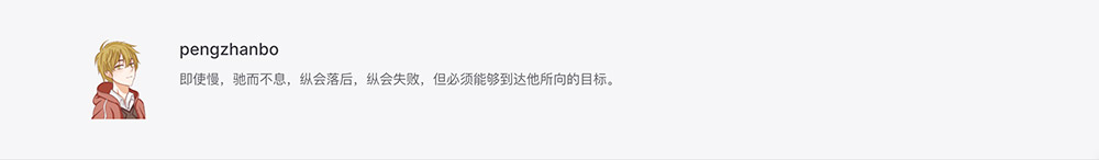
type: profile
name: pengzhanbo
description: 即使慢,驰而不息,纵会落后,纵会失败,但必须能够到达他所向的目标。
avatar: /images/avatar.png
---效果:
custom
- 类型:
PlumeThemeHomeCustom
自定义内容,在 README.md 的 文件中,编写的 markdown 内容,将会被插入到 对应的区域。
interface PlumeThemeHomeCustom extends PlumeHomeConfigBase {
  type: 'custom'
}
示例:
---
home: true
config:
-
type: custom
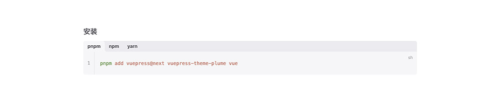
---
### 安装
:::code-tabs
@tab pnpm
```sh
pnpm add vuepress@next vuepress-theme-plume vue
```
@tab npm
```sh
npm install vuepress@next vuepress-theme-plume
```
@tab yarn
```sh
yarn add vuepress@next vuepress-theme-plume
```
:::效果:
自定义区域类型
当主题内置的区域类型不足以满足你的需求时,你可以自定义区域类型。
每一个自定义区域类型,本质上都是一个组件。
一个 简单的实例如下:
your-component.vue
<script setup lang="ts">
import type { ThemeHomeConfigBase } from 'vuepress-theme-plume'
import { VPHomeBox } from 'vuepress-theme-plume/client'

const props = defineProps<ThemeHomeConfigBase & {
  // 组件 props, frontmatter 中的属性将会传递给组件
}>()
</script>

<template>
  <VPHomeBox
    :type="type"
    :background-image="backgroundImage"
    :background-attachment="backgroundAttachment"
    :full="full"
  >
    <!-- 自定义你的内容 -->
    <div>...</div>
  </VPHomeBox>
</template>
在 .vuepress/client.ts 在 enhance 钩子中添加 组件
.vuepress/client.ts
import { defineClientConfig } from 'vuepress/client'
import YourComponent from 'your-component.vue'

export default defineClientConfig({
  enhance({ app }) {
    app.component('your-component', YourComponent)
  },
})
然后,你就可以在 README.md 中使用 your-component 了。
---
home: true
config:
  -
    type: 'your-component'
    # ...
---