
Icons
Overview
The theme supports icons from the following sources in Markdown files:
- iconify - Supported by default
- iconfont - Optional
- fontawesome - Optional
The theme provides Markdown syntax support for icons, offering a simple and flexible way to insert icons in Markdown.
The theme also provides <Icon /> component support. Click to learn more
Syntax
Icon syntax is inline syntax and can be mixed with other Markdown syntax within paragraphs.
Basic Syntax: Use :: to wrap the icon name:
::name::Setting Icon Size and Color: (Note: Spaces are required)
::name =size::
::name /color::
::name =size /color::=size: Set icon size=16: Icon width and height are16px=24x16: Icon width is24px, height is16px=x16: Icon height is16px, width is auto=1.2em: Icon width and height are1.2em=1.2emx1.5em: Icon width is1.2em, height is1.5em
/color: Set icon color, supportshex/rgb/rgba/hsl/hslaand other valid color values/#fff: Icon color is#fff/rgb(255,0,0): Icon color isrgb(255,0,0)
Iconify
iconify provides support for 200K+ open source icons, sufficient for most project needs. The theme uses iconify as the default icon source.
Use the ::collect:name syntax in Markdown to insert icons.
Configuration
import { defineUserConfig } from 'vuepress'
import { plumeTheme } from 'vuepress-theme-plume'

export default defineUserConfig({
  theme: plumeTheme({
    markdown: {
      icon: { provider: 'iconify' } // Supported by default
    }
  })
})
interface IconOptions {
provider: 'iconify'
prefix?: string
}Usage
Search for the desired icon at iconify search and copy the icon name:
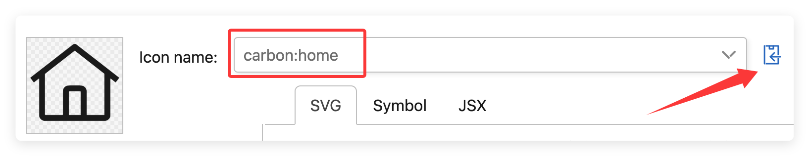
Use the
::collect:namesyntax in Markdown to insert the icon::carbon:home::Output:
In Iconify, icons are organized into different collects, each containing several icons. In the ::collect:name syntax, use : to separate collect and name.
If you primarily use icons from a specific collect, you can specify prefix in the configuration to omit the collect prefix in the ::collect:name syntax:
import { defineUserConfig } from 'vuepress'
import { plumeTheme } from 'vuepress-theme-plume'

export default defineUserConfig({
  theme: plumeTheme({
    markdown: {
      icon: {
        provider: 'iconify',
        prefix: 'carbon', // Use `carbon` icon collection by default
      }
    }
  })
})
::home:: <!-- Uses `carbon` icon collection by default, auto-completes to `carbon:home` -->
::solar:user-bold:: <!-- Explicitly use other icon collections -->Output:
Installation
For enterprise internal projects or situations where external network resources cannot be accessed, the theme recommends installing the @iconify/json dependency.
The theme automatically parses icon data from @iconify/json and packages used icons as local resources.
pnpm add @iconify/jsonyarn add @iconify/jsonnpm install @iconify/jsonExamples
Input:
github: ::tdesign:logo-github-filled::
Change color: ::tdesign:logo-github-filled /#f00::
Change size: ::tdesign:logo-github-filled =36px::
Change size and color: ::tdesign:logo-github-filled =36px /#f00::

Colorful icon ::skill-icons:vscode-dark =36px::
Output:
github: Change color: Change size: Change size and color:
Colorful icon
Iconfont
iconfont provides massive icon support.
Configuration
import { defineUserConfig } from 'vuepress'
import { plumeTheme } from 'vuepress-theme-plume'

export default defineUserConfig({
  theme: plumeTheme({
    markdown: {
      icon: {
        provider: 'iconfont',
        assets: 'https://at.alicdn.com/t/c/xxxx.css' // Example URL
      }
    }
  })
})
interface IconOptions {
provider: 'iconfont'
/**
* Icon prefix
* @default 'iconfont icon-'
*/
prefix?: string
/**
* iconfont resource URL
*/
assets: string | string[]
}Usage
Go to iconfont Help Center to learn about Creating Projects and Adding Icons
Get the project resource URL from iconfont, copy and paste it into the
assetsconfiguration: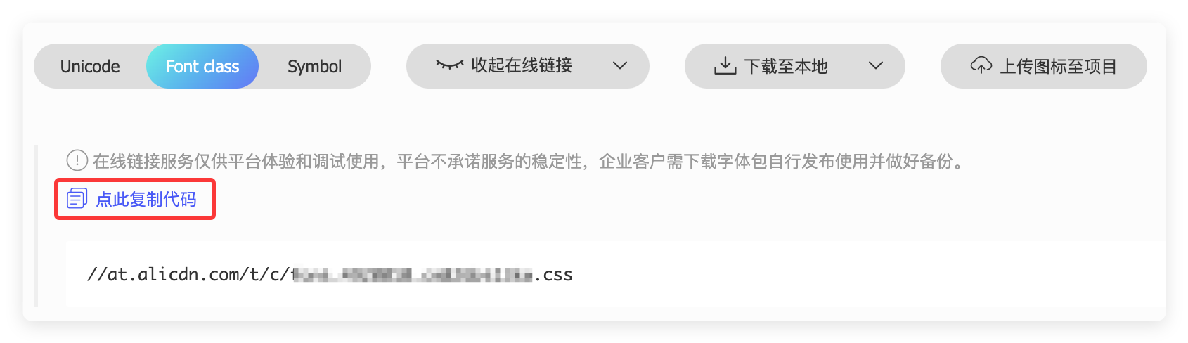
export default defineUserConfig({
  theme: plumeTheme({
    markdown: {
      icon: {
        provider: 'iconfont',
        assets: 'https://at.alicdn.com/t/c/xxxx.css' // Example URL
      }
    }
  })
})
You can also choose to download it locally, store the resources in the
.vuepress/publicdirectory, and then fill in the local file path in theassetsconfiguration.Check the iconfont project configuration to get the
prefixconfiguration:
The
prefixconfiguration consists offont familyandfont classprefix. If the iconfont project uses default settings, thenprefixisiconfont icon-, in which case you can skip this step.export default defineUserConfig({ theme: plumeTheme({ markdown: { icon: { provider: 'iconfont', prefix: 'iconfont icon-', // Default value } } }) })Use the
::name::syntax in Markdown to insert icons: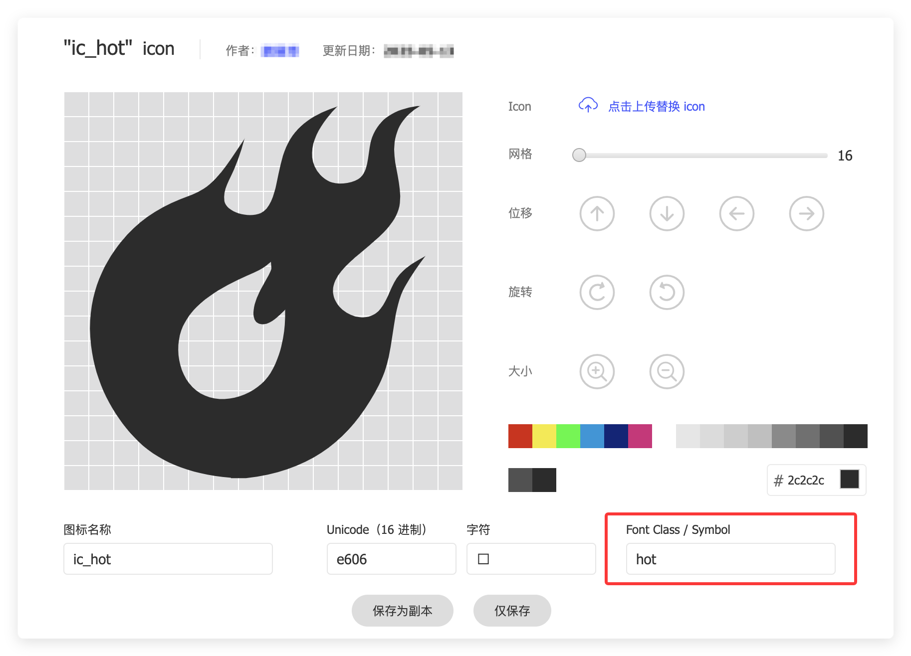
Fill the
font classfrom the image into the::name::syntax:::hot:: ::hot =24px:: ::hot =24px /#f00::Output:
Fontawesome
Fontawesome provides both free and paid icon support. Paid icons require a subscription.
View Fontawesome official documentation
Configuration
import { defineUserConfig } from 'vuepress'
import { plumeTheme } from 'vuepress-theme-plume'

export default defineUserConfig({
  theme: plumeTheme({
    markdown: {
      icon: {
        provider: 'fontawesome',
        assets: 'fontawesome' // Preset resource URL, loaded from CDN
      }
    }
  })
})
interface IconOptions {
provider: 'fontawesome'
/**
* Icon prefix
* @default 'fas'
*/
prefix?: FontAwesomePrefix
/**
* iconfont resource URL
*/
assets: (FontAwesomeAssetBuiltin | string)[]
}
type FontAwesomeAssetBuiltin = 'fontawesome' | 'fontawesome-with-brands'
type FontAwesomePrefix
= | 'fas' | 's' // fa-solid fa-name
| 'far' | 'r' // fa-regular fa-name
| 'fal' | 'l' // fa-light fa-name
| 'fat' | 't' // fa-thin fa-name
| 'fads' | 'ds' // fa-duotone fa-solid fa-name
| 'fass' | 'ss' // fa-sharp fa-solid fa-name
| 'fasr' | 'sr' // fa-sharp fa-regular fa-name
| 'fasl' | 'sl' // fa-sharp fa-light fa-name
| 'fast' | 'st' // fa-sharp fa-thin fa-name
| 'fasds' | 'sds' // fa-sharp-duotone fa-solid fa-name
| 'fab' | 'b' // fa-brands fa-nameIn Fontawesome, icons are controlled by families + styles. View details
For easier management, you can use the ::prefix:name:: syntax to set families + styles through the prefix. The default prefix is fas, which can be omitted:
::name:: <!-- prefix = fas -->
::fas:name:: <!-- prefix = fas -->
::s:name:: <!-- prefix = fas, s is shorthand for fas -->
You can modify the default prefix by configuring markdown.icon.prefix.
Tips
Fontawesome's free icons only support solid, some regular, and brands. For the free version, prefixes only support fas / far / fab and their shorthand prefixes.
Usage
Go to https://fontawesome.com/search?ic=free to search for free icons
Copy the icon name:
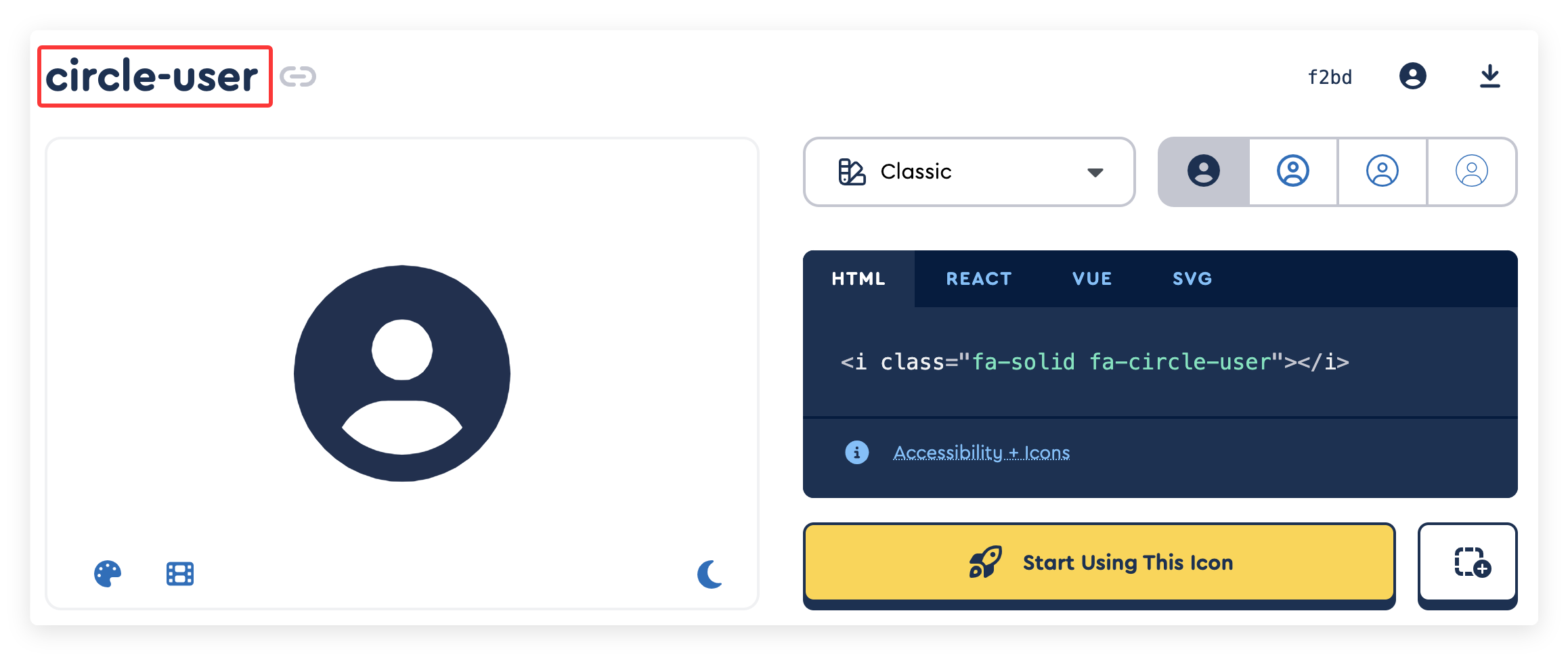
Use the
::prefix:name::syntax in Markdown to insert the icon:::circle-user:: <!-- prefix = fas --> ::fas:circle-user:: <!-- prefix = fas --> ::s:circle-user:: <!-- prefix = fas, s is shorthand for fas -->
Examples
::circle-user::
::circle-user =24px::
::circle-user =24px /#f00::
Output:
Add more style support for Fontawesome
::circle-user 2xl::  <!-- 2xl is shorthand for fa-2xl, icon size is 2em -->
::circle-user rotate-90:: <!-- icon rotated 90 degrees -->
::circle-user beat:: <!-- icon animation -->
::circle-user border:: <!-- icon border -->
::circle-user 2xl beat:: <!-- mixed styles -->
Output:
Additional Notes
When markdown.icon.provider is set to a value other than iconify, iconify remains supported by default, and you can still insert iconify icons in Markdown:
In the ::collect:name:: syntax, add iconify at the beginning:
::iconify carbon:home::Output:

